Exploring how visual design and dynamic features transformed the web experience over time.
Static to Dynamic
The late 1990s marked a turning point in web development as websites began to shift from static, text-heavy pages to visually engaging and interactive platforms. Two key technologies, JavaScript, introduced in 1995 by Brendan Eich at Netscape, and Cascading Style Sheets (CSS), standardized by the W3C in 1996, revolutionized how developers could control both behavior and presentation. JavaScript enabled dynamic interactions like form validation, mouseover effects, and real-time updates. CSS allowed designers to separate content from styling, making websites more flexible and visually appealing.
JavascriptCSS
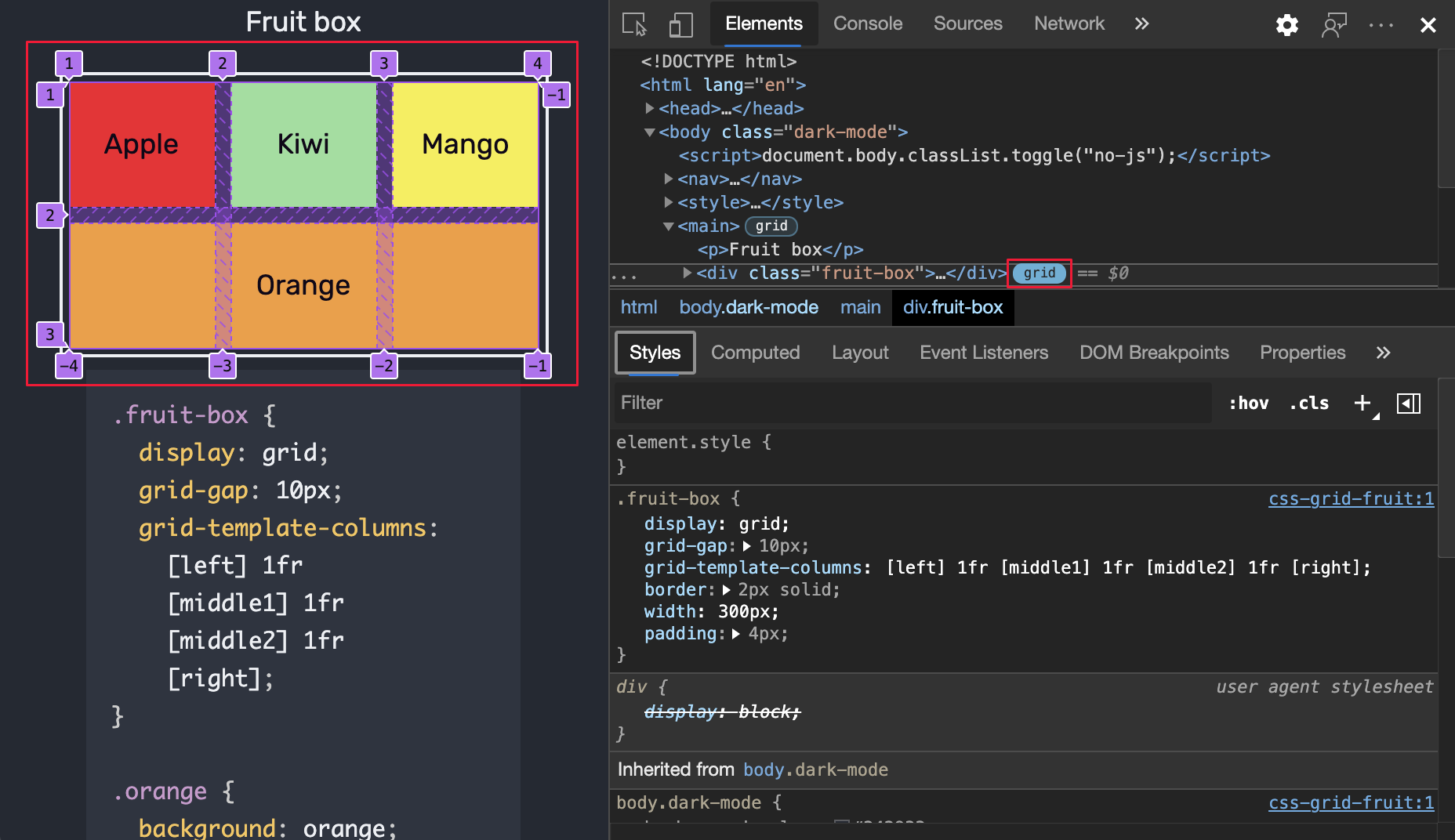
During this period, table-based layouts became the dominant method for structuring web pages. Though originally intended for displaying tabular data, HTML tables were repurposed to create multi-column designs and nested grids. Designers used spacer GIFs and layout hacks to achieve pixel-perfect control, often at the cost of accessibility and performance.
HEADER
SIDEBAR
Navigation links or extra info
MAIN CONTENT
This is where the main article or page content would go.
FOOTER
Contact info, copyright, etc.
Meanwhile, Flash emerged as a powerful tool for adding animations, audio, and interactive elements. Entire websites were built in Flash, showcasing splash pages, product demos, and games. However, these sites were often slow to load and inaccessible to search engines and screen readers.
The Rise of Web 2.0
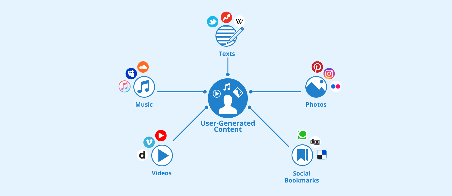
By the early 2000s, the web entered the Web 2.0 era, a paradigm shift defined by user-generated content, interactivity, and collaboration. Platforms like Blogger, Myspace, and Wikipedia empowered users to create and share content. YouTube and Facebook redefined social engagement online. Web 2.0 emphasized participation over consumption, turning websites into living communities rather than static destinations. This shift also introduced new challenges around moderation, data privacy, and digital identity. Nevertheless, it fundamentally changed how people interacted with the internet.
Mobile-First and Beyond
The 2010s ushered in a seismic shift in web development, driven by the explosive growth of smartphones and tablets. With mobile devices accounting for over half of global web traffic by the mid-2010s, designers and developers were forced to rethink how websites were built and experienced. No longer could sites be optimized solely for desktop screens. Users demanded seamless, intuitive access from any device, anywhere.
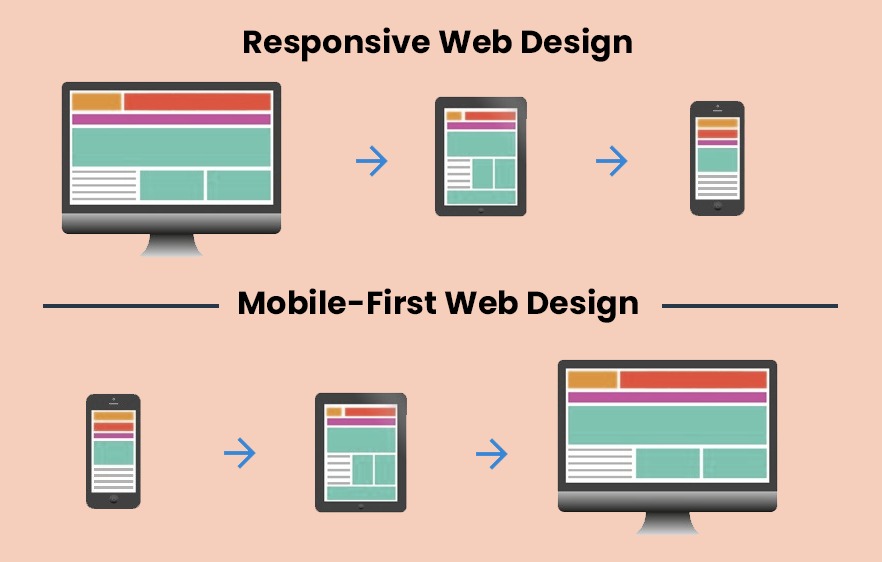
This demand gave rise to responsive web design, a technique that allows websites to adapt fluidly to different screen sizes and orientations. Using CSS3 media queries, developers could define breakpoints that triggered layout changes based on device width, resolution, or orientation. Combined with flexible grids and fluid images, responsive design ensured that content remained readable and navigable whether viewed on a phone, tablet, or desktop.
Alongside responsiveness came the mobile-first design philosophy, which flipped traditional development on its head. Instead of designing for desktop and scaling down, developers began with the smallest screen and built upward. This strategy emphasized performance, clarity, and essential content, especially important for users on slower mobile networks or limited data plans. Touch-friendly interfaces became critical, with larger buttons, simplified navigation, and gesture-based interactions like swiping and pinching.
The mobile revolution also fueled the rise of Content Management Systems (CMS) like WordPress, Wix, and Squarespace. These platforms democratized web development, allowing users with little to no coding experience to build responsive, mobile-optimized websites using drag-and-drop editors and pre-designed templates.